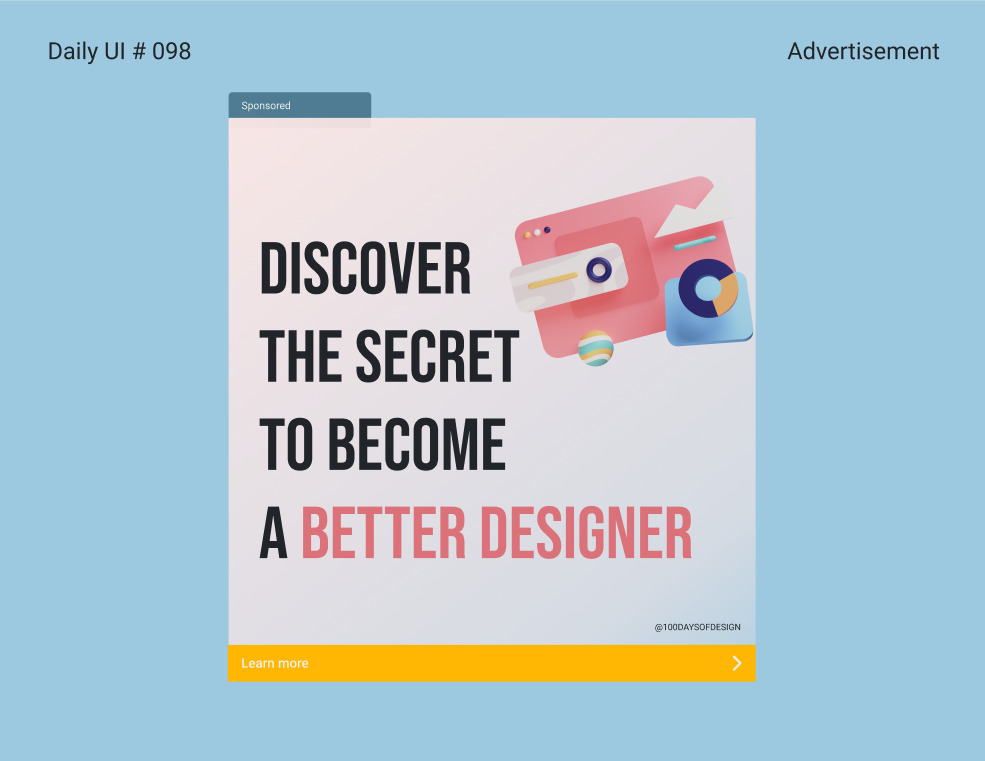
The daily UI challengelasts 100 days. Prompts are sent only on working days. No challenge is sent on the weekend. So every day of the week, a new prompt is sent to your mailbox. Here is what I learned from finishing this challenge :
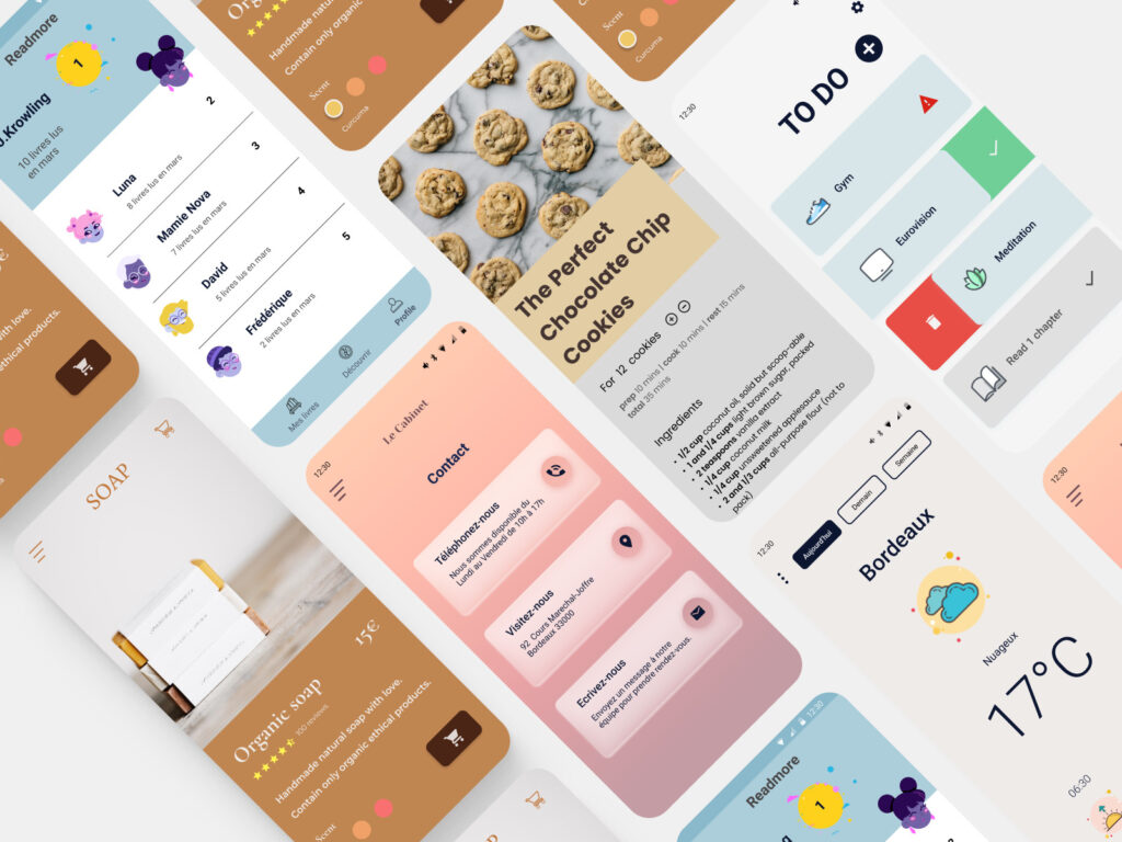
You can find 100 days here.
1. Templates, plugin are now my new BFF
I think it was Bill Gates who said something about lazy people doing things more efficiently. This challenge made me lazy. In UI design, some actions can be repetitive or tedious, so I tried to find easier ways to do them. The quest for the best plugin or templates was launched. I have considerably improved my workflow on Figma and Adobe XD thanks to that.
Figma community is full of incredible templates and plugins. As for Adobe XD, despite some interesting things, it was less impressive. Behance too, helped me in my quest.
Some of my favorite Figma plugins were :
- Blush an illustration generator
- Font scales a typography's tool that help create nice information architecture
- Icons8 for icons
- Mapsicle A map generator
- Dating : a calendar generator
- Stark : to check screens accessibility
2. Figma VS Adobe UX
Figma and Adobe XD are two widely used software (at least in France). I've worked half half on them (50 days on Figma and 50 days on Adobe XD). I am now a hard core Figma fan. intuitif et efficacePrototyping on Adobe XD is a bit more limited than on Figma as well as the plugin library. And I can't over the fact that I have to open Photoshop just to crop a picture 🙄.
3. The devil is on the details
The challenge offer prompt on subjects often forgotten or neglected such as : CGU, FAQ or tooltip. Thanks to the daily UI challenge, I finally took the time to think a little bit more carefully about those elements. I tried new things or tried to make them more accessible. FAQ ou les CGU ; des éléments qui sont parfois survolés ou auxquels on pense en dernier. Cela permet de se poser des questions sur ces petits éléments. De découvrir plusieurs façons d’égayer ces éléments ou de tenter de nouvelles choses.
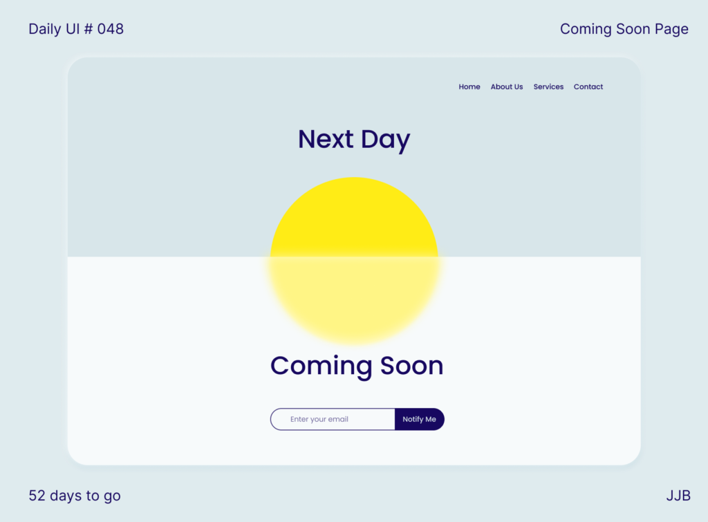
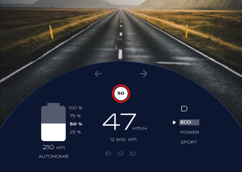
4. Apps, web, or car windshield ?
When you think about UX/UI, you see web pages or mobile apps. But in our world, there is so much more screen than those. The challenge put me out of my comfort zone and opened new horizons. I've designed a car windshield or self-checkout. I've also discovered that I have more fun designing big screens.
5. Test trends
Some trends stay, some are just a phase. As a UX/UI designer you must be aware of them, even if you like them or no. I've tried neumorphism, glassmorphism or gradients. The website I used the most for trendy colors palets was : coolorsA real goldmine.
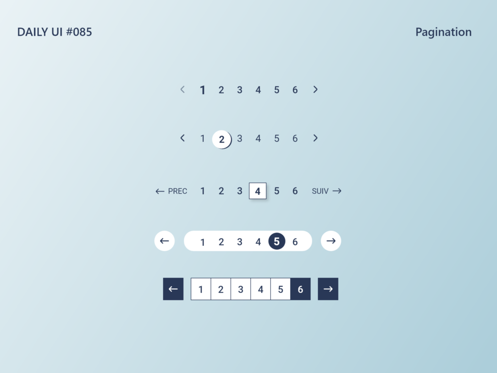
6. Daily UI weak points
There is a large variety of subjects. But some are repetitive. Having a full day on buttons when you have already designed 50 pages with those, is that really necessary ? There were also a lot of nuance between some subjects. For example : location tracker and mapLocation tracker can be an element of a map.
Don't reinvent the wheels, is something you heard often in design or in tech. video playerIs this necessary to design a video player? The UX side of the story is forgotten. But it is not the goal of this challenge.
Conclusion
The 100 days of Design challenge is a good way to try out new software, explore new elements of design or improve your workflow. I would recommend it to new designers or bored seniors.